

Valkyrie Power Bowls
A design assignment in my graphic design 3 class to brand a restaurant from the topic given to us. My topic was healthy fast food. It inspired me to look at acai bowls, which have great benefactors and quick creation time.
Case Study
Role:
Illustrator
Designer
Researcher
Software:
Illustrator
InDesign
Photoshop

Valkyrie Power Bowls is a healthy smoothie bowl restaurant located right off Route 1 in Rehoboth Beach, Delaware. Valkyrie is open all year round from 7am to 7pm, so we can offer the best meal at the times you are craving it the most. Most smoothie bowl locations are either in downtown Rehoboth Beach or only open in the summer. Here at Valkyrie, we want to be here for you year-round and in an easy to access area! What else separates us from the rest? We give back to the community! Our smoothie bowls are made with produce purchased by local produce stand owners and farmers. We showcase our partnership within the store giving them a spotlight on our in house menus. Looking for a good, quick meal after a long workout? We have you covered from protein boosted bowls to our supportive health bowls, you can feel refueled and ready for the day. Want something a little more on your cheat day? We got bowls that are tasty and delicious.

Logos
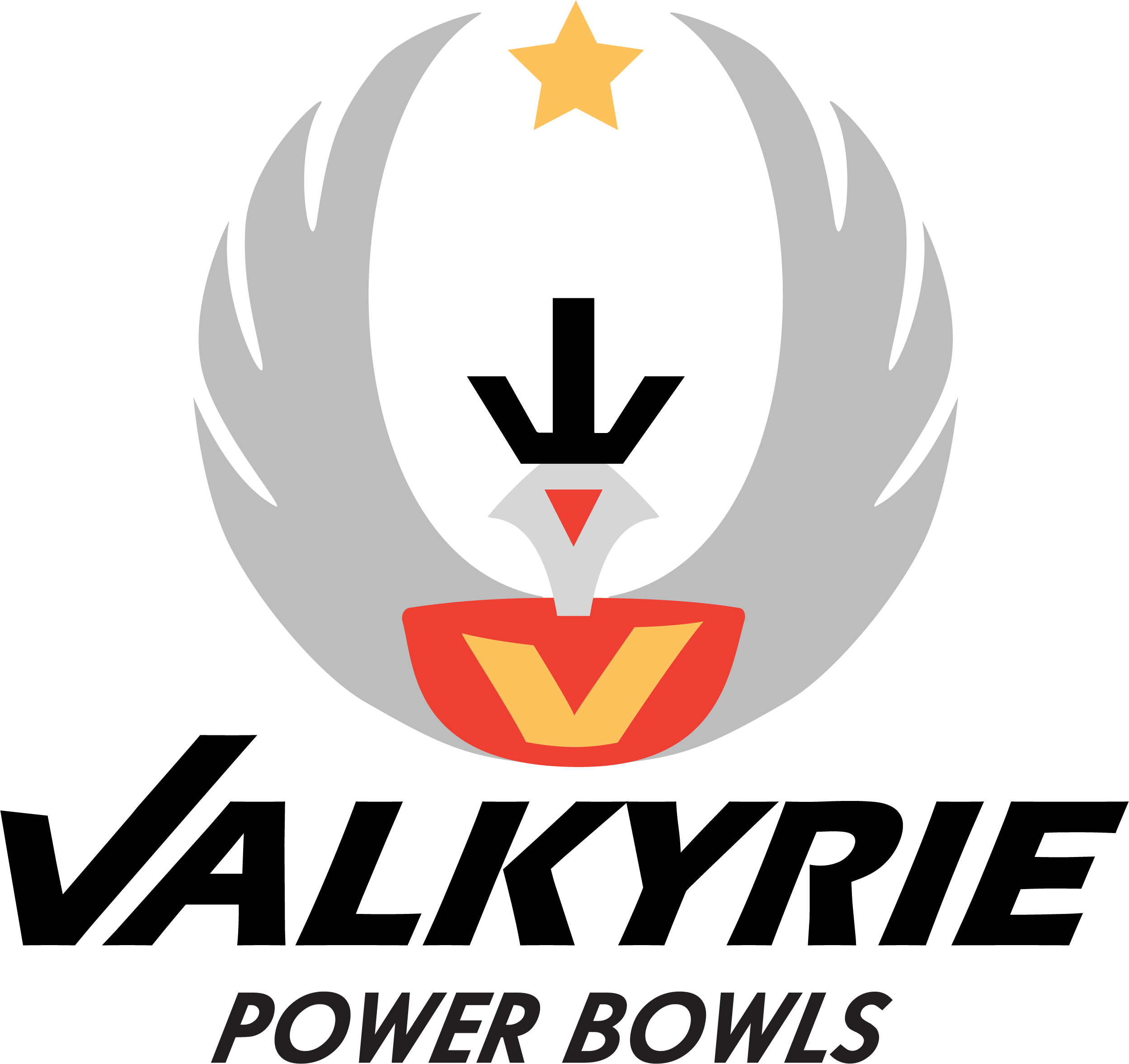
Primary Full Color
Secondary Full Color

Brandmark Full Color
About the Design Collateral
When designing Valkyrie Power Bowls, there is more than just the logo. While most of my peers had fancy menus, or special types of packaging, I had a focus on the physical collateral and fast food aspects that would get put into your hand with out you realizing. They go from the physical takeaway menu to the rewards card. Designs I created were all based from my research online and actively going to fast food chains. Uniform was one of the biggest collaterals I saw similar to each other, so I decided to create a t-shirt, hat, and name pins by hand. I screen printed the shirt and ironed on hat designs. Along with this, I created the name tag buttons with different names to showcase the use of them. For the packaging and other fun collateral, I wanted to always run with a theme of strong. With the sign for outside, I want something that can almost light the way in the dark. With the packaging, clear containers and simple sticker makes for quick and easy creation behind the counter. Pushing for more of a fast-food style that would contain the order number within the bowl sticker. The loyalty card works well with getting the customers to come back more often by receiving a gift from purchasing nine bowls. For the menu, easy foldable take out menus fit perfectly. Great for quick grabs and can be left at any places located around us like gyms, businesses, and even homes. While walking in you would have more of a television menu or a kiosk taking your order, these menus are good for attracting people or getting them to order online.
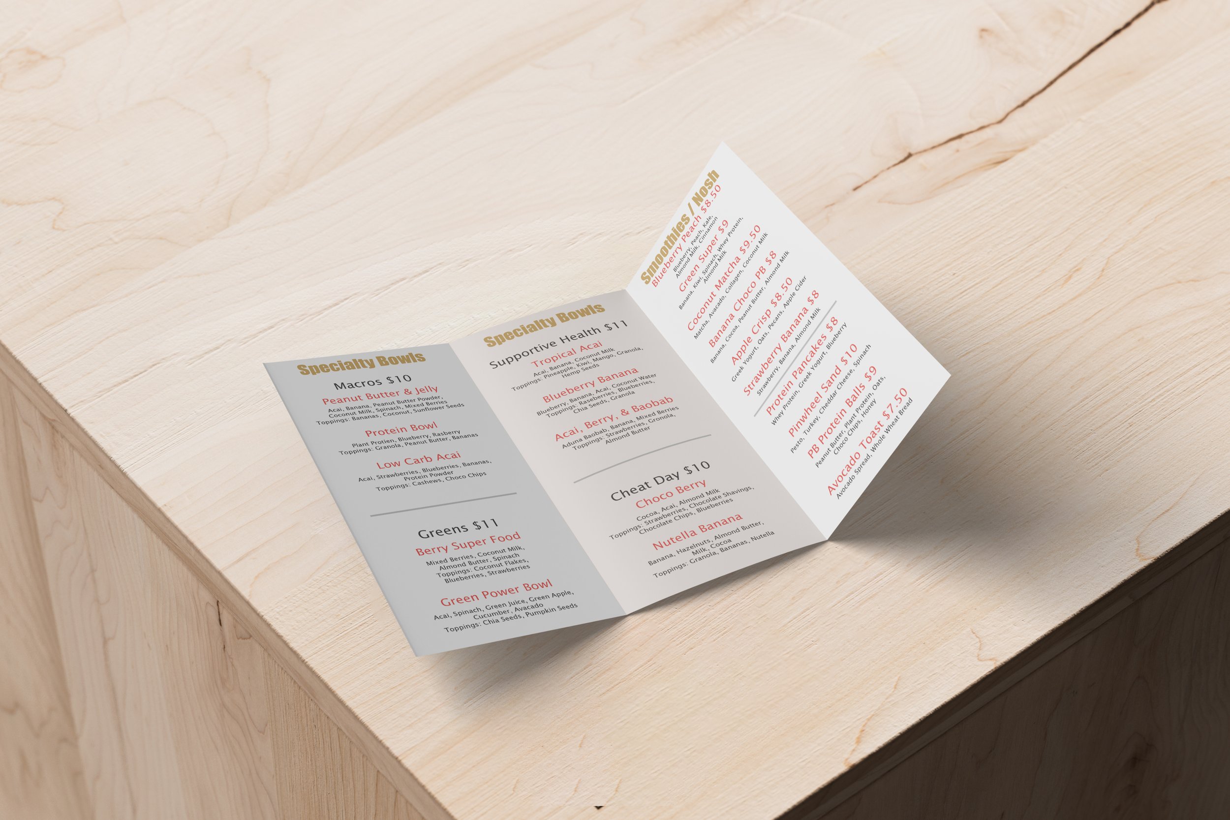
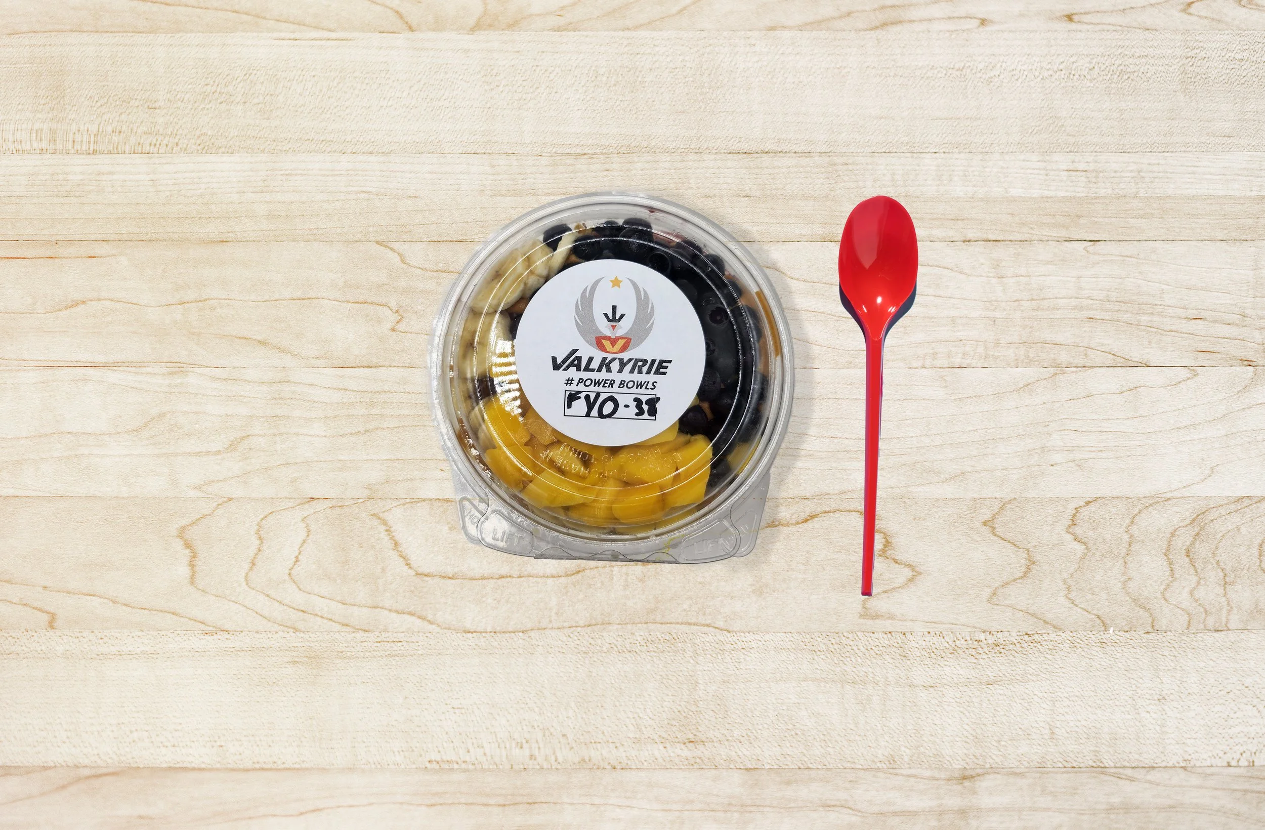
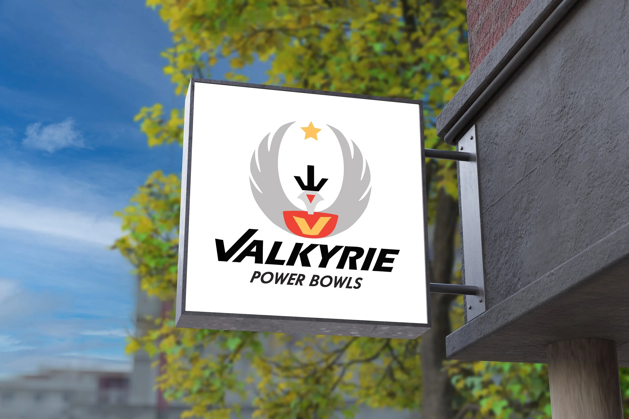
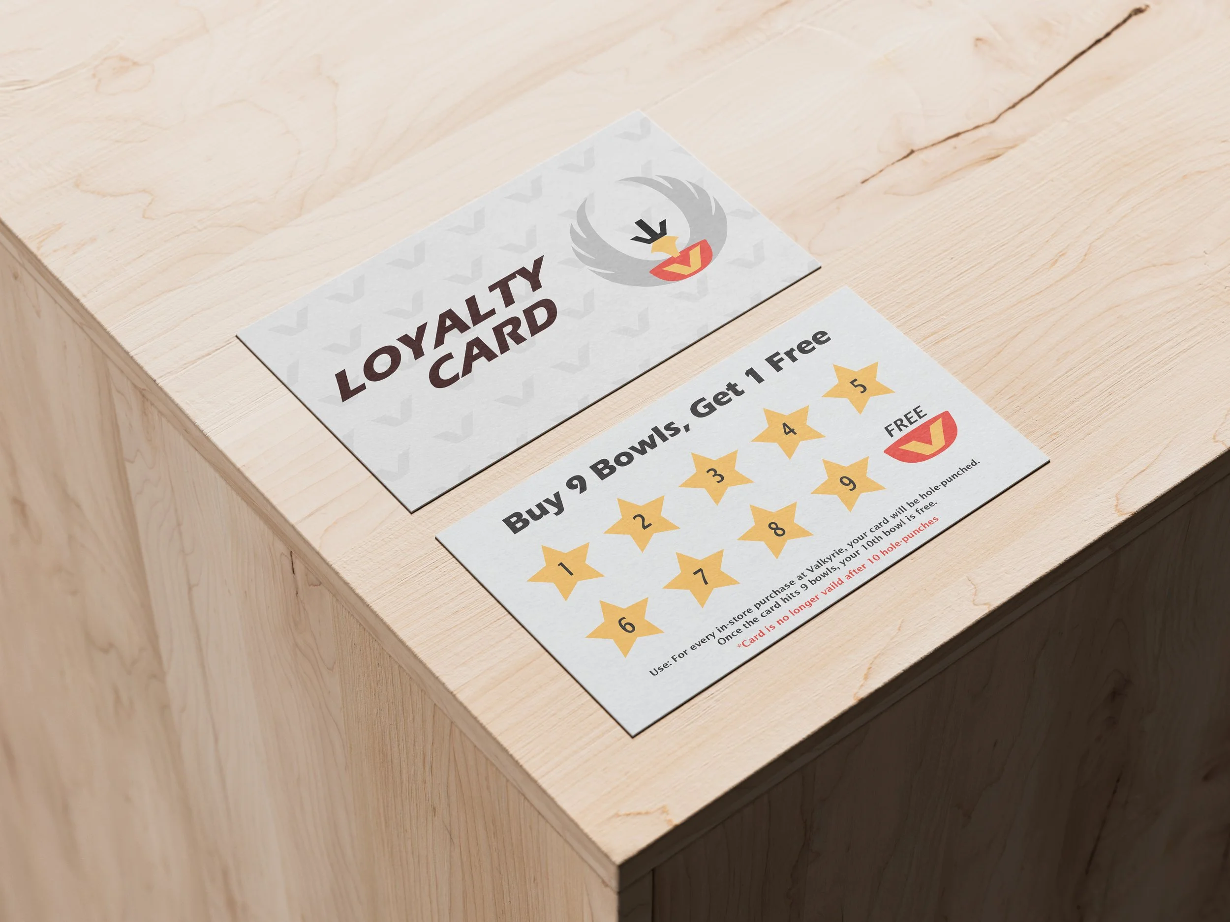
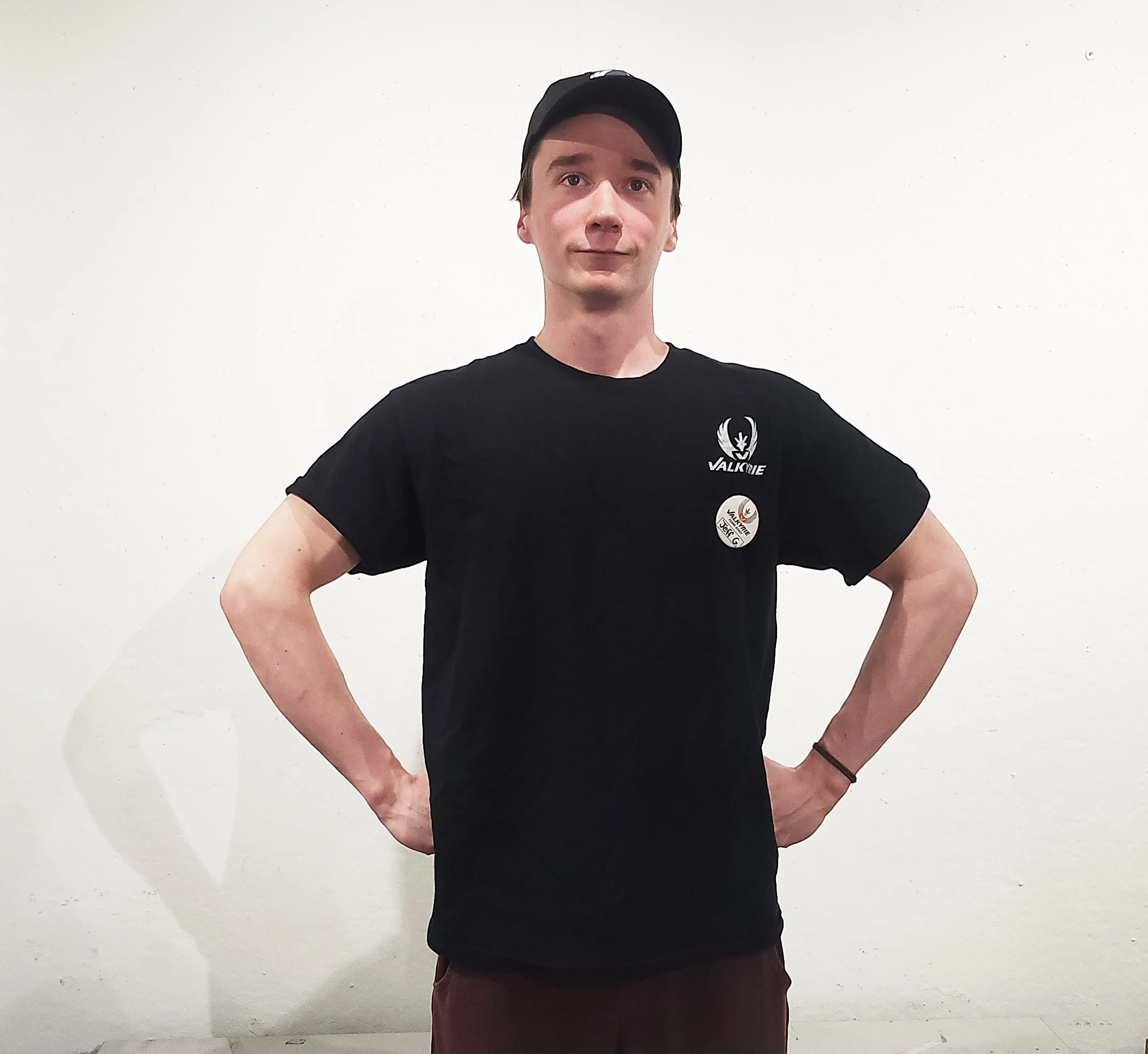
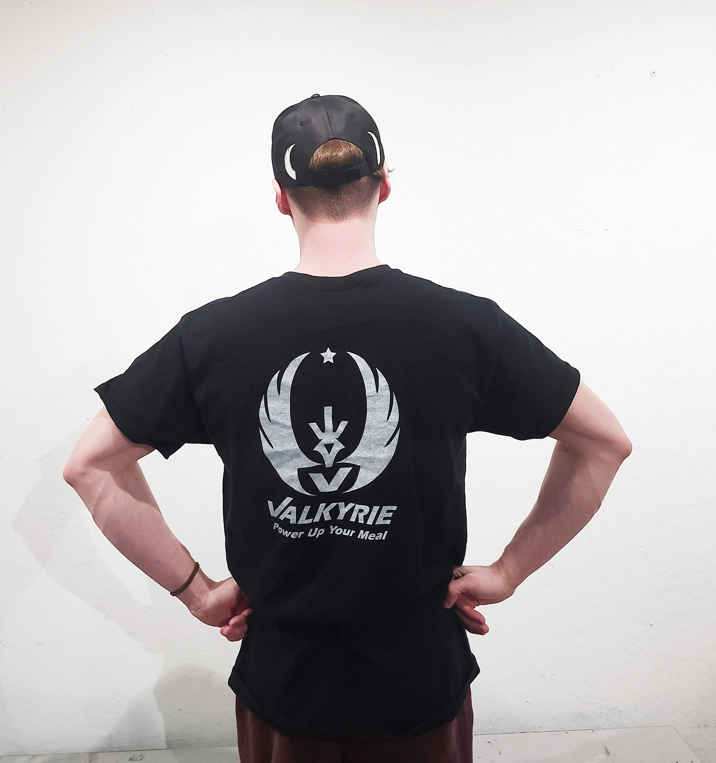
Pictured: Menu, packaging, store street sign, loyalty card, t-shirt front with hat and name pin, t-shirt back with back of hat