JidoZhooshy
Music Festival
My final thesis gallery, based around a music festival I created from the ground up under the name JidoZhooshy.
Case Study
Role:
Illustrator
Designer
Researcher
Creator
Software:
Illustrator
Photoshop
AfterEffects
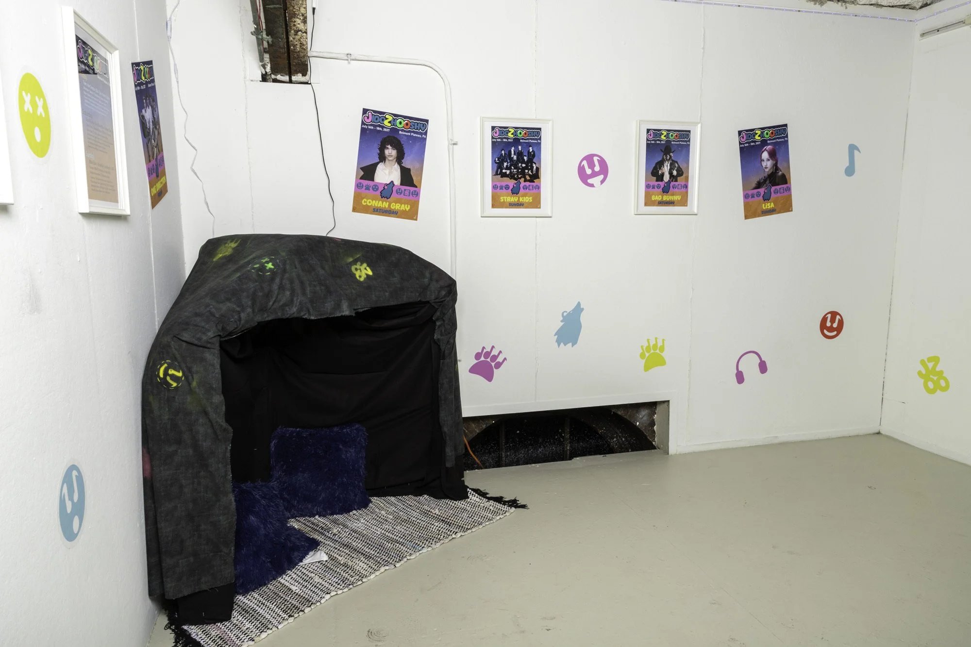
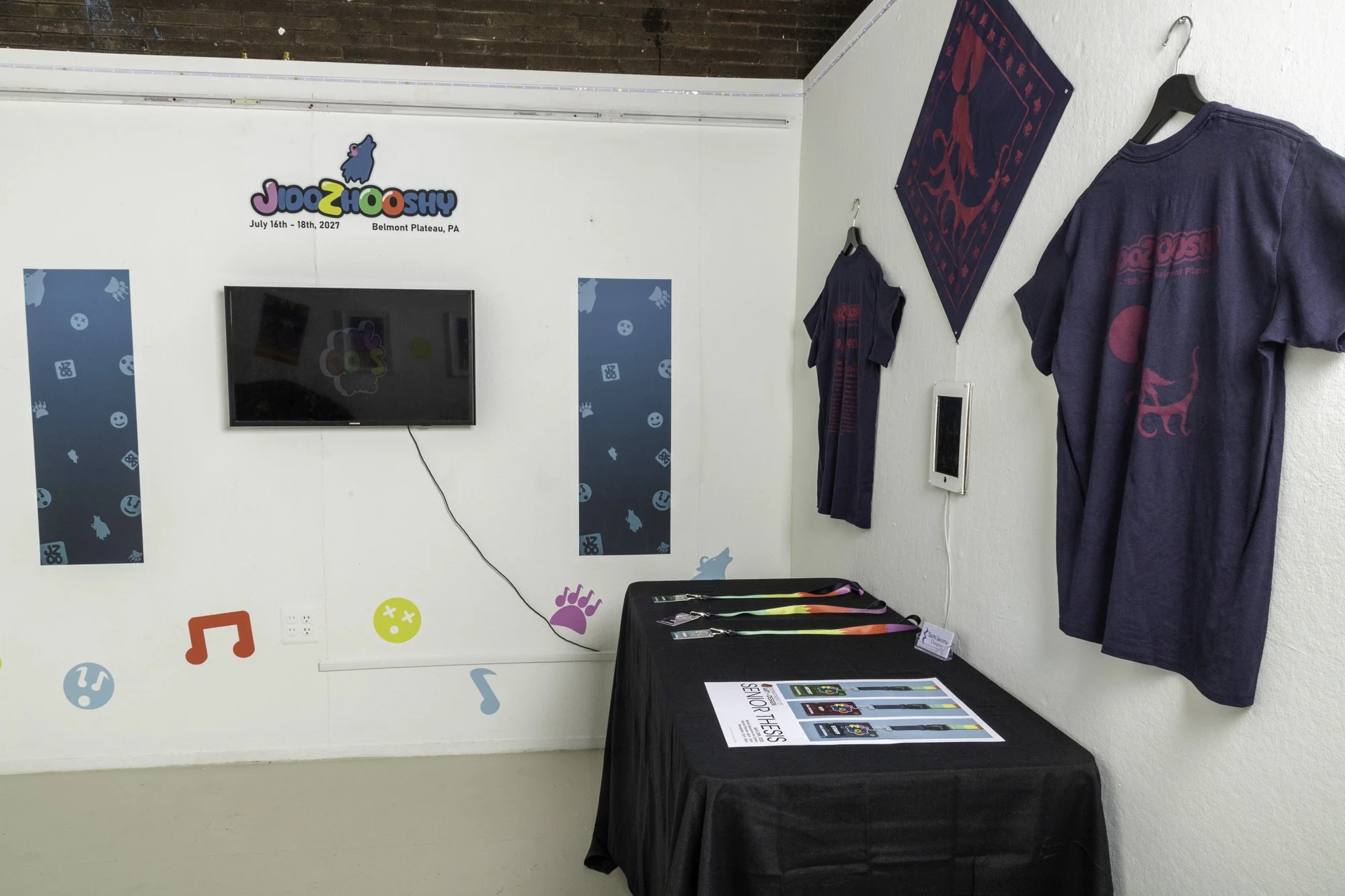
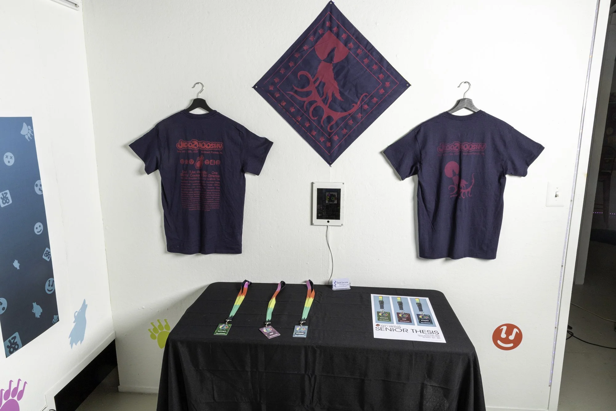
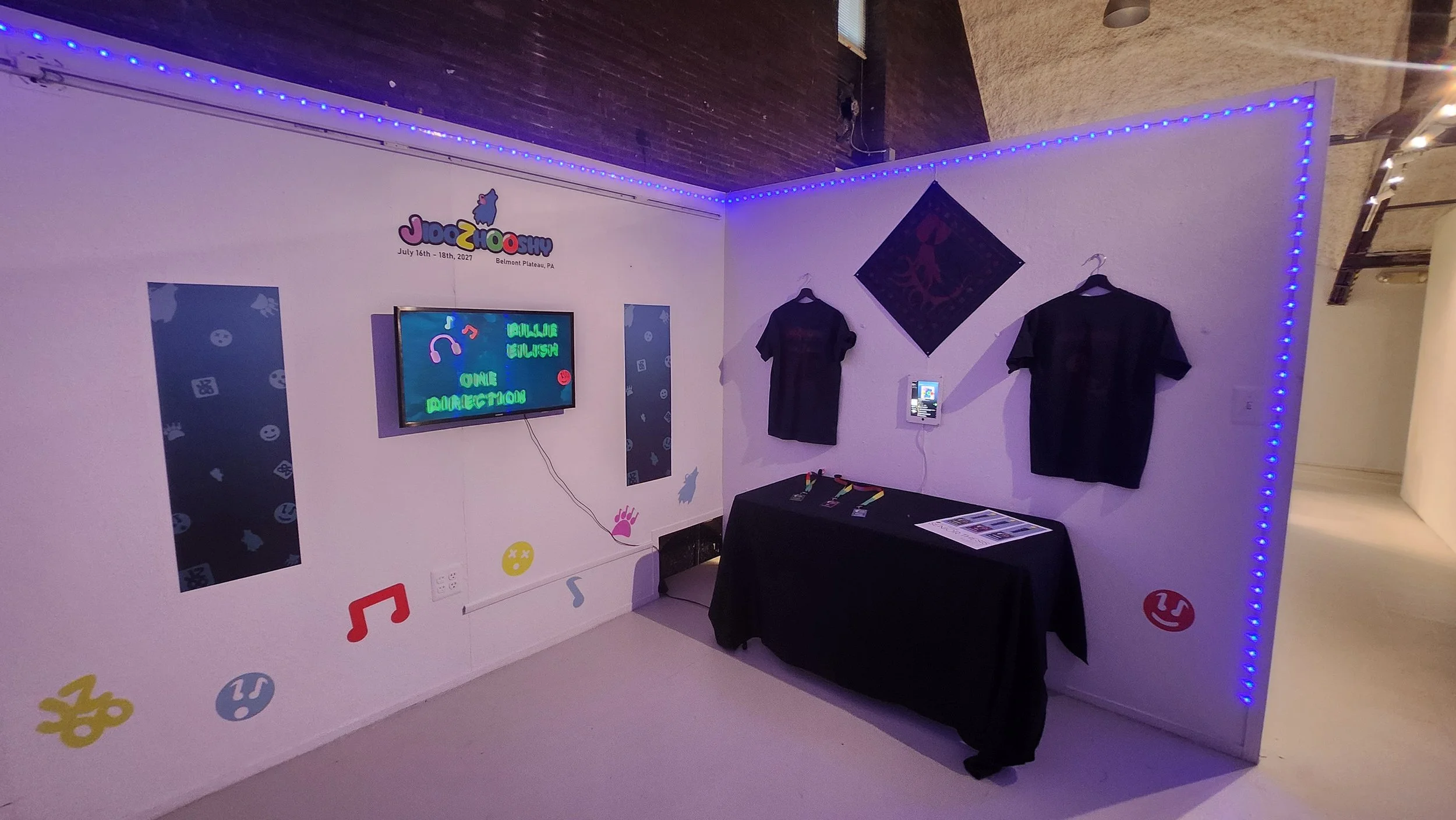
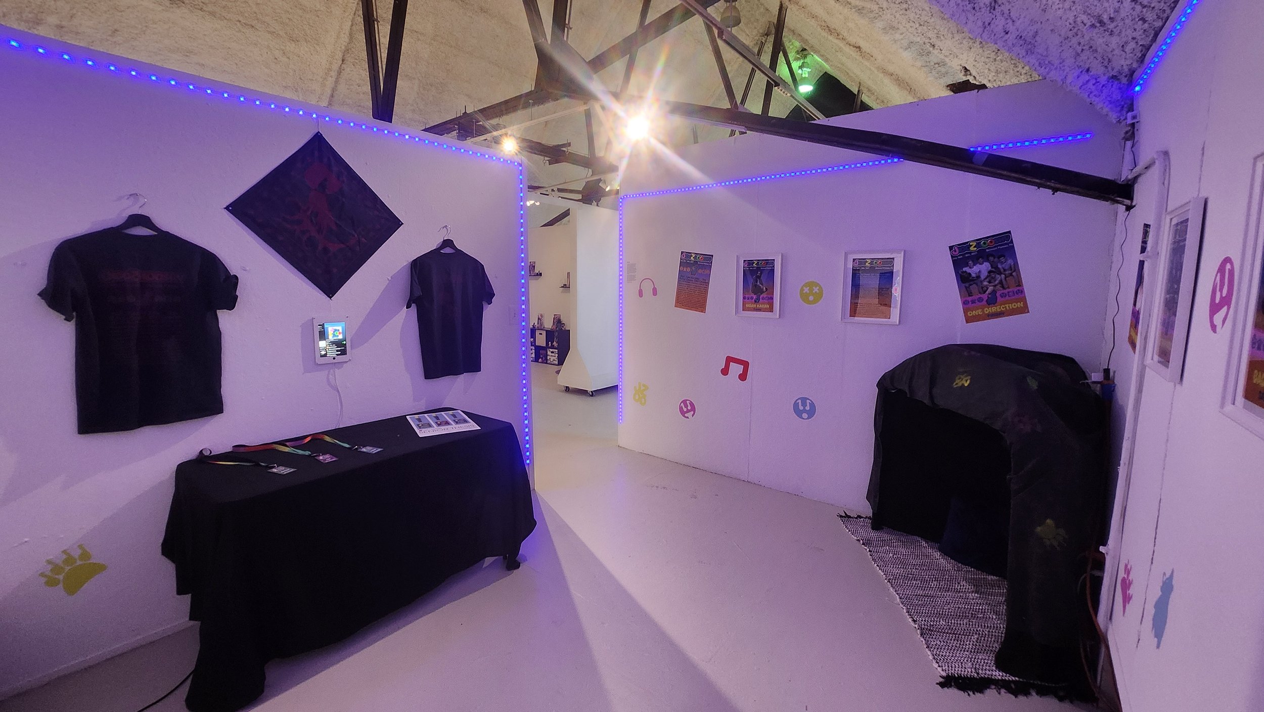
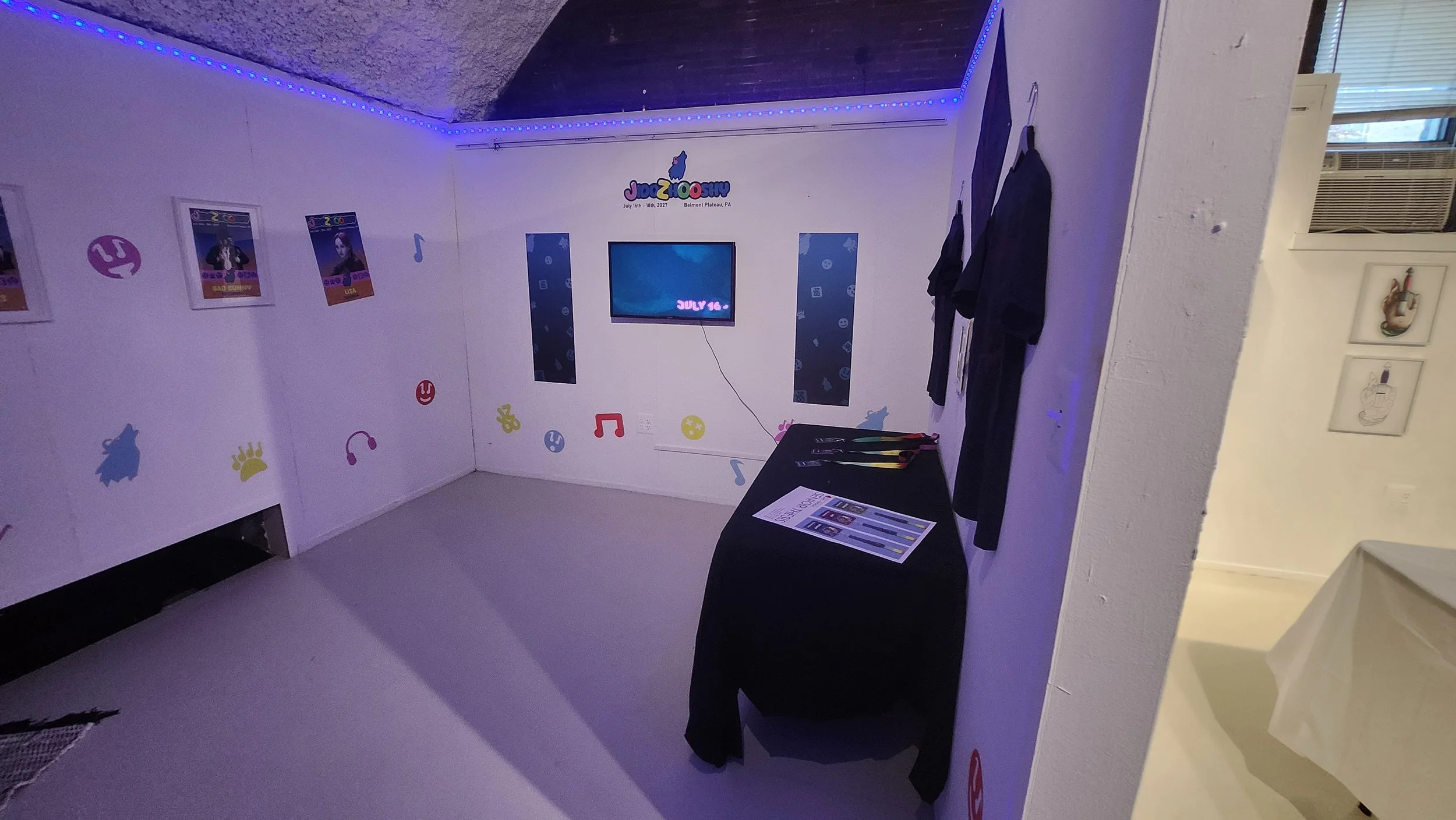
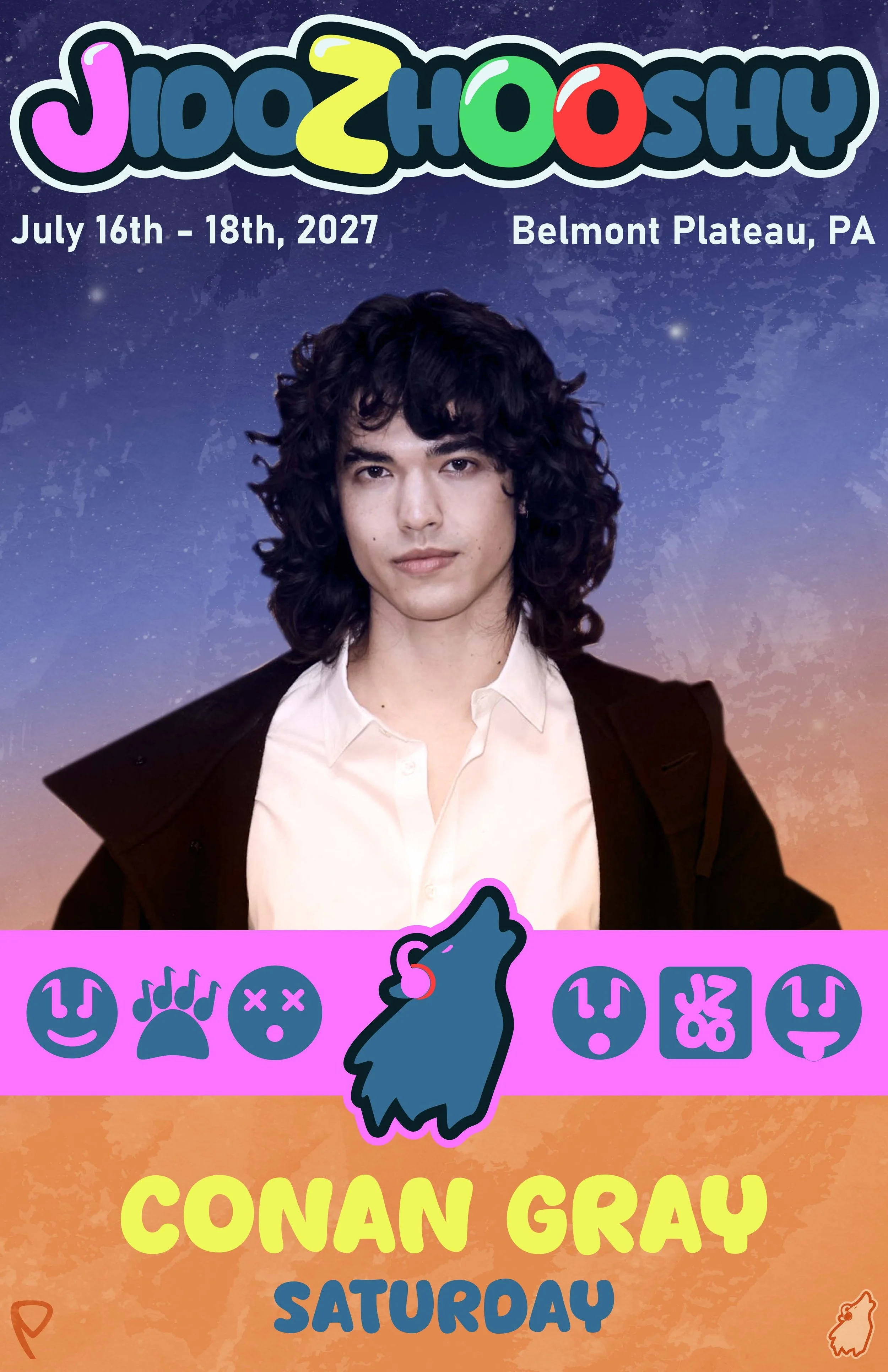
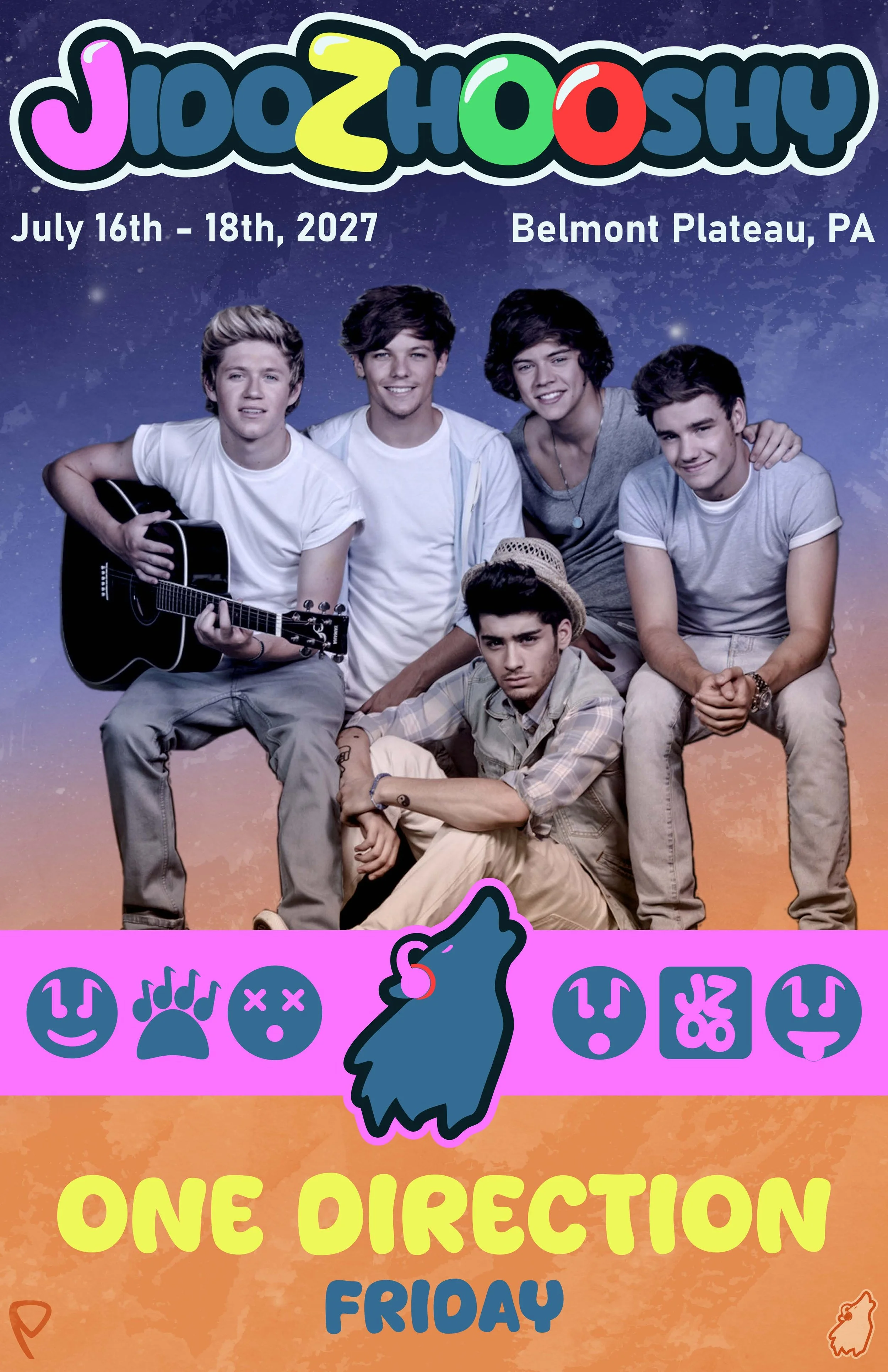
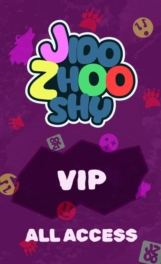
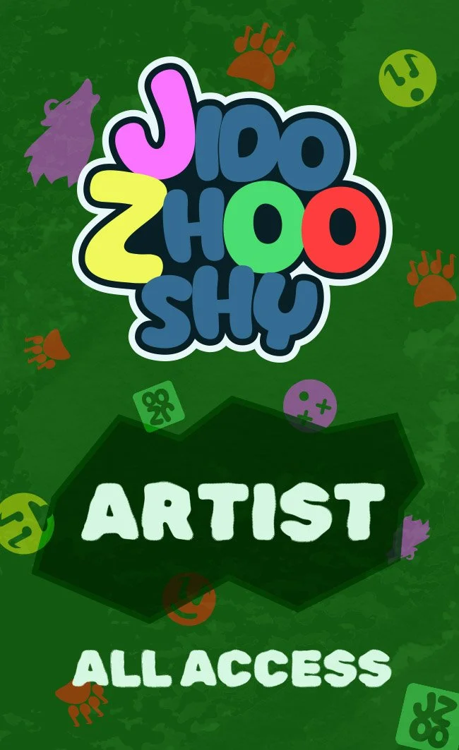
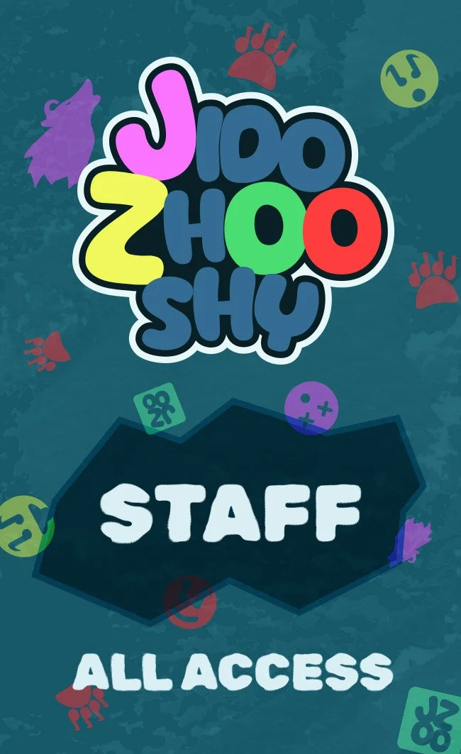
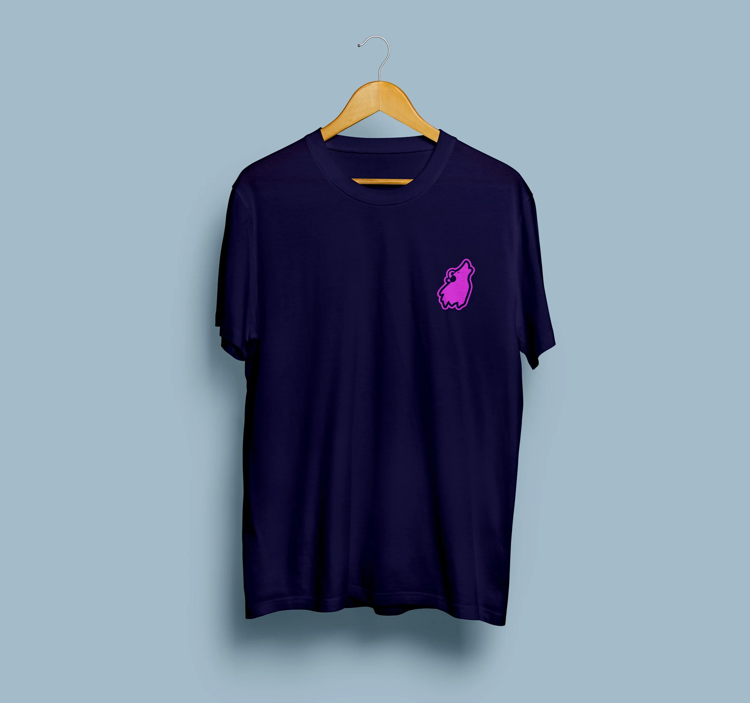
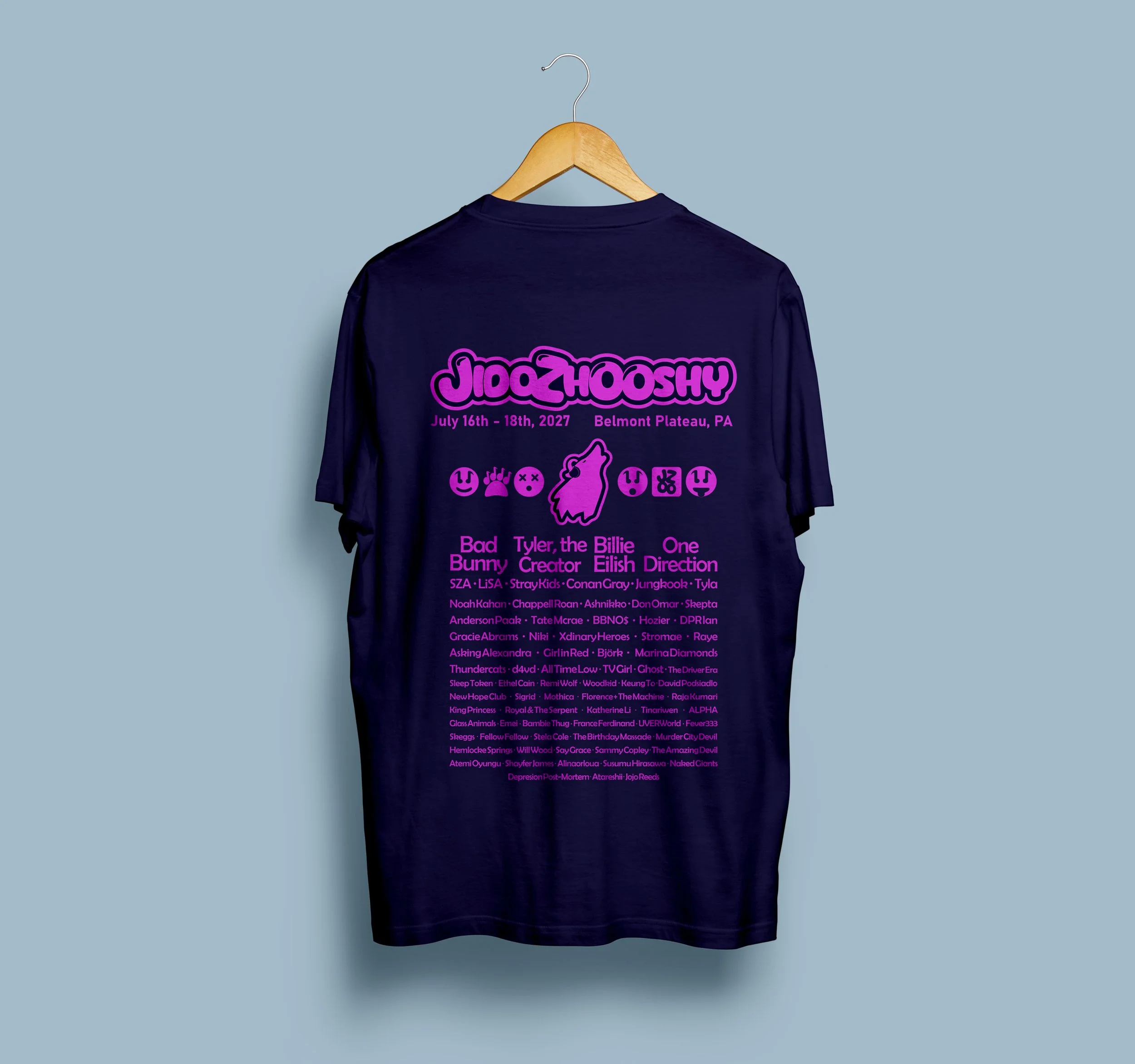
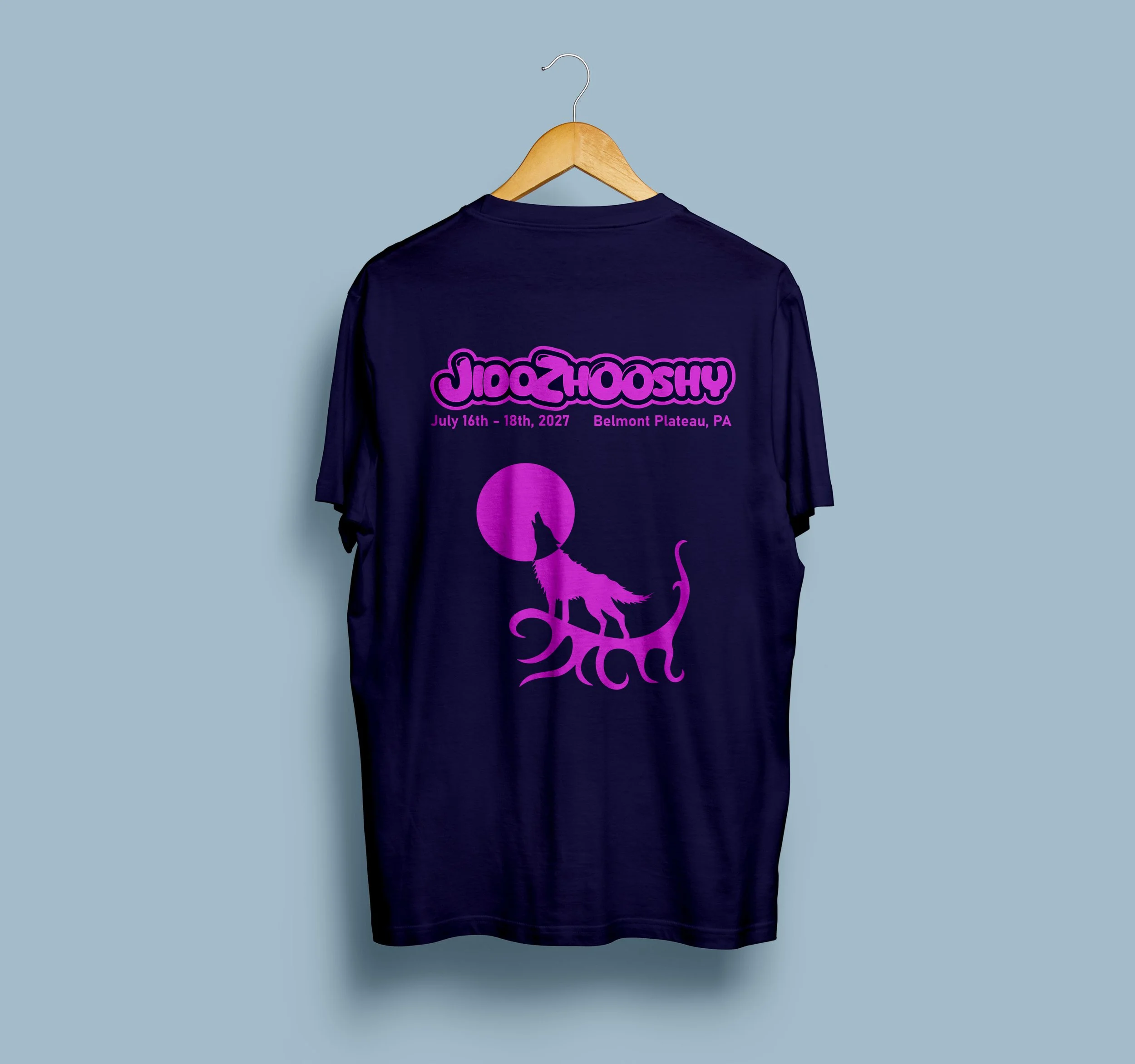
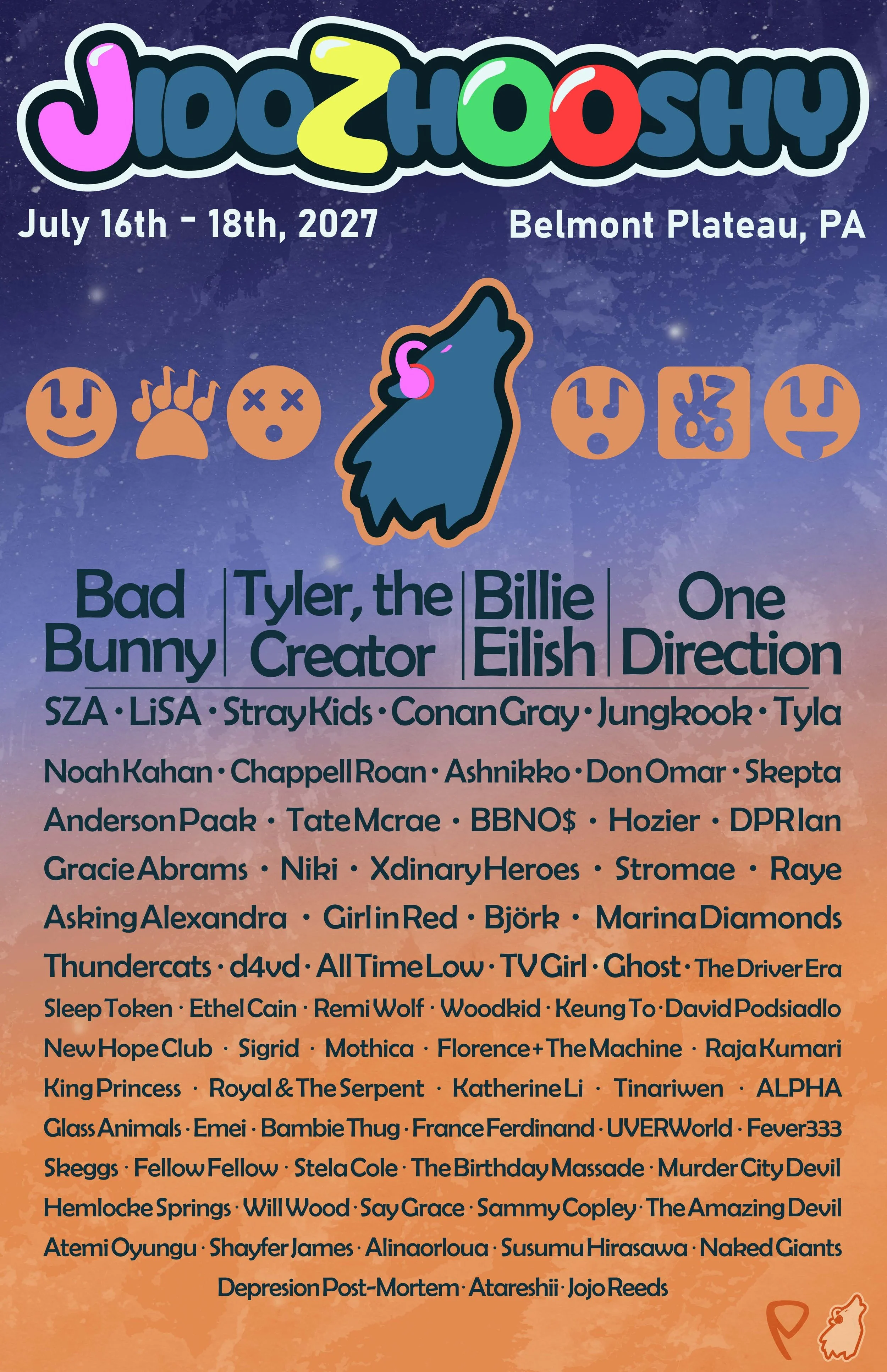
When it comes to creating this festival, JIDOZHOOSHY(Ge-doe-zuh-hoo-shy), I wanted to make an event that brings people together to listen to many different genres of music from around the world to the city of Philadelphia. ‘Jido’ means map in Korean and ‘Zhooshy’ a slang word from New Zealand meaning flashy, creating what we know now as flashy music from all over the map. The festival pulls popular artists from many different countries to create a fun blend of popular pop to Swedish rock you can headbang to. Like all branding it starts with the narrative and logo. This is the reason the company is different, with fun and playful colors and bouncy text. Building the emoji like icons and the theme of underground, wolf pack with some notes similar to “Jinx” from Arcane and her spray paint drawings. Using watercolor for textures on posters to give a cave wall look and take graphics to pull the worlds of traditional mediums and designs together. Similarly to how I have brought people together through the global connection of music. This gallery consists of many collateral you would see within the music industry. Line-up posters, headliner posters, stage design, marketing, apparels, passes, and even photo opportunities. I researched many poster designs finding many grungy styles with typefaces that match their themes or logos. Which led to my style of the cave texture and serif style type to balance out the playful logo. The logo itself took trials and error until I found one which fits the festival’s overall message; welcoming, fun, and flashy. The backstage passes became a requirement for many music events, especially for festivals to tell the difference easily between general admission and the VIP. The passes are color-coded to tell the difference between the different types of backstage passes, Artist, VIP, and Staff. Each were given the stacked logo design with the similar texture to the posters to tie them together to the theme. The marketing part was a learning process, with having to learn After Effects within three weeks. The aim to create something to be posted to social media to advertise the headliners coming to the festival with taking the logo and textures to create a cave theme. I found the the names weren’t enough so I added a loading animation to split the loop a bit with a coin flip style on the logo and adding depth to make a more 3D effect. Displayed on a TV framed by two stage banners with Icons that would represent music and the festival. In tandem with the animation, I created a physical cave to have a space for photo opportunities similar to festivals where they can find ways to get advertising through fun picture moments. There was wood, fabric, chicken wire, and spray paint to create this picture space. To invite more to sit and take it in, I added a rug and pillows. I tied everything together by creating a music playlist with all of the artist who are attending and performing which played and displayed through a speaker and Ipad.
Logo
Primary
Tertiary
Brandmark
Animation
Headliner announcement motion graphic video
